Typography

SKETCH
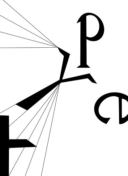
This was my original digital sketch. I wanted to play with direction and lines which could be incorporated into the text.
DESIGN
Having decided that I was happy with the design, I next digitally filled in the letters to make them block colour rather than pencil, and also darkened the lines.
COLOUR
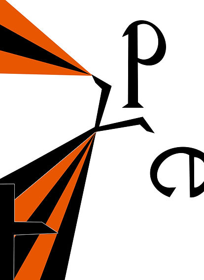
I then tried playing with colour to enhance the design. I initially wanted to keep the theme largely monotone, sticking to just three colours (white, black and orange). However, I quickly realised that using black in the stripes detracted from the overall design as it meant that the letter T was barely visible, meaning that I had to outline it in white.

My next thought was to introduce a fourth colour, which was still dark (as I liked the contrast between black and orange) but enough of a difference that the letters would be legible. However, I felt that this made the design too chaotic, and ruined the directional flow which draws your eye to the central focal point on the Y.


I therefore decided that perhaps using black in the stripes was not the best idea. I re-examined my original design and realised that I preferred having thin lines as oppose to thick stripes, as I felt that this enabled the type to stand out more. However, I thought that it would be interesting to create vibrant backdrops (taking inspiration from art movements such as pop art) to juxtapose the letters, which are a simple solid black.
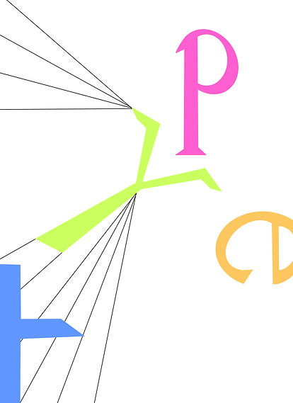
Whilst I liked the colours in the above designs, I wanted to experiment with changing the colour of the type itself, rather than the background. I, therefore, incorporated more muted versions of my previous designs' colour schemes into the letters. However, I wasn't too happy with the black of the lines, as I felt that it didn't fit into the softer colour scheme.

FINAL DESIGN
Therefore, I used the colours of the letters on the lines. I really like this final design as I feel that it incorporates all the best elements of the previous concepts.